The battle for attention on the web has never been fiercer—especially when the goal is to turn casual visitors into qualified leads.
Ebooks have become one of the most powerful lead magnets in modern marketing strategies.
Today, the effectiveness of an ebook landing page no longer depends solely on an attractive design or a simple email form. Every detail matters—from the headline promise and the strategic position of the CTA button, to the delicate balance between informative content, engaging visuals, and a frictionless form.
This precise mechanism explains why some experts convert 35% of their traffic into qualified leads, while others struggle to reach even 5%.
Let’s dive into the world of high-performing ebook landing pages—their key components, weaknesses, and best practices that can skyrocket your conversion rate or, on the contrary, destroy your lead generation efforts.
What Is a High-Performing Ebook Landing Page? Definition and Specifics
An ebook landing page stands out for its single purpose: converting website visitors into leads or customers through the download of a digital book.
While a traditional web page informs, guides, or tells a story, the ebook landing page focuses all attention on the value being offered—your ebook.
The Main Goal of an Ebook Landing Page: Turning Visitors into Leads
The central mission of such a page revolves around one goal—collecting contact information from interested visitors in exchange for access to valuable, downloadable content.
This process follows a simplified funnel:
a strong message, a polished presentation of the ebook, a concise form, and a clear call-to-action (CTA) button.
These elements together optimize every step of the conversion journey.
How It Differs from a Standard Web Page
Unlike a general homepage, which usually contains multiple menus and navigation links, an ebook landing pageremoves all distractions.
There are no sidebars or external links to other articles.
Every pixel is dedicated to driving one action—the ebook download.
This intense focus on a single goal explains the huge conversion gap between a well-optimized ebook landing pageand a homepage or product page.
Showcasing Your Offer: How to Effectively Promote Your Ebook
The heart of an ebook landing page lies in its ability to present your digital book as a credible solution to your visitor’s problem.
Rather than simply describing the ebook, the page must emphasize tangible benefits—new skills to acquire, clear answers to a specific question, or an innovative method to help the reader progress.
The content should connect with the visitor’s pain points, feature testimonials, and even include a short preview.
Anyone who fills out the form should feel confident they’re receiving something truly valuable—not just another generic PDF.
Highlighting the Downloadable Content
Your ebook content should feel real and reassuring.
In addition to an engaging summary of the chapters, many marketers include sample pages, a table of contents, or key excerpts.
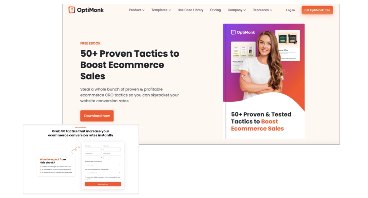
Visuals showing the ebook cover displayed on a tablet, smartphone, or laptop help create a sense of tangibility and encourage action.
The user must be able to visualize the ebook’s value before downloading it.
Why Optimize Your Ebook Landing Page? A Critical Marketing Priority
The success of an ebook landing page no longer depends on being “clear and pretty.”
There are two main objectives: boost conversion rates and strengthen content credibility.
In a world where users are increasingly skeptical, optimization is now a decisive factor in any successful marketing campaign.
Whether you’re launching a new ebook or nurturing your existing audience, every optimized detail—headline, visuals, form length, CTA placement—multiplies your chances of turning a curious visitor into a convinced reader.
Capturing and Retaining Attention: The Keys to a Persuasive Ebook Landing Page
Competition is intense. Hundreds of messages flood users’ screens every day, so your page must capture attention fast—and hold it.
A powerful headline should be clear, actionable, and benefit-driven, such as:
“Discover the Proven Method to Double Your Skills This Year.”
Adding a short teaser video can further strengthen engagement and credibility.
A realistic ebook mockup—shown dynamically on a tablet or smartphone—reinforces trust and authenticity.
Finally, the page structure must guide the reader through a clear logical flow: from the problem faced, to the solution offered, to the promise delivered by the ebook.
Key principles for an effective ebook landing page:
- Use immersive visuals instead of generic stock photos
- Write a benefit-driven description, not just a functional one
- Highlight results achieved by other readers or clients
From the very first seconds, the visitor should feel both personally involved and reassured by the value of your content.
Minimalist Navigation: Maximizing Ebook Landing Page Conversion Rates
The more options you give, the fewer conversions you get—this is the golden rule of any modern ebook landing page.
Removing the top navigation bar, limiting external links, and focusing on the essentials minimizes distractions and reduces the temptation to leave the page.
The most effective CTA buttons are strategically placed, visually highlighted, and connected to a single capture form.
This streamlined approach helps boost conversion rates without complicating the user journey.
Free Ebook: Why Optimization Remains Essential for Lead Generation
Many creators fall into the trap of thinking “free = high conversion rate.” Nothing could be further from the truth.
Even when offered for free, an ebook will only attract quality leads if its perceived value is high and if downloading it feels like a real step forward for the visitor.
Optimization remains essential across several key elements:
- Simplify the form fields
- Highlight the ebook’s uniqueness (original data, bonuses, case studies)
- Ensure the CTA button is crystal clear (“Get my guide now”)
To optimize is to make the ebook irresistible—to create real anticipation for the download.
That level of refinement marks the difference between a simple participation and true conversion success.
Conversion Rates and Performance of Ebook Landing Pages
More than just a metric, the conversion rate reflects the true efficiency of an ebook landing page.
It’s the key indicator that determines whether the page fulfills its purpose—or whether its content and design need to be reworked.
Statistics show that, when properly configured, ebook landing pages consistently outperform general-purpose web pages.
Understanding and Measuring the Conversion Rate of an Ebook Landing Page
The conversion rate measures the number of concrete actions (downloads or signups) compared to the number of unique visitors.
For instance, if an ebook landing page receives 1,000 visitors and generates 200 downloads, the conversion rate stands at 20%.
This figure—closely monitored by every marketing team—should be compared against industry benchmarks.
In the B2B sector, a solid conversion rate for an ebook landing page typically ranges between 12% and 18%, compared to only 3% to 5% for a standard homepage.
Why Do Ebook Landing Pages Convert Better?
Several factors explain this performance gap.
First, the specialization of the offer eliminates hesitation—the value proposition is immediate (“Download this exclusive guide for free”).
Second, the minimalist structure directs every visitor toward the desired action, without excessive distractions.
Finally, personalization (promise, testimonials, engaging CTA) fosters a climate of trust.
Key success factors:
- A clear offer, not diluted by competing products
- A concise, well-designed form without unnecessary fields
- Optimized copywriting focused on action
These combined elements reinforce both the persuasive power of the page and the perceived quality of the ebook being offered.
Adapting Your Strategy Based on Ebook Landing Page Results
Continuous tracking of key metrics allows you to fine-tune your marketing campaign as performance evolves.
If the conversion rate is too low, several adjustments may help:
- Rework the CTA button (wording, size, color)
- Shorten the form to reduce friction
- Add credibility indicators about the author or company
- Strengthen the demonstration of the ebook’s value and benefits
In some cases, the entire core promise must be re-evaluated—if your audience doesn’t identify with the content, the page will fail to convert.
Repositioning the page may also involve testing different visuals, segmenting audiences, or experimenting with new headlines that directly address the primary pain points of your prospects.
Examples and Best Practices for an Effective Ebook Landing Page
Imitating top performers is second nature to lead generation experts.
A flawless ebook landing page follows proven principles—adapted to its target audience and topic.
Let’s break them down through a series of best practices and real-world examples from various industries.
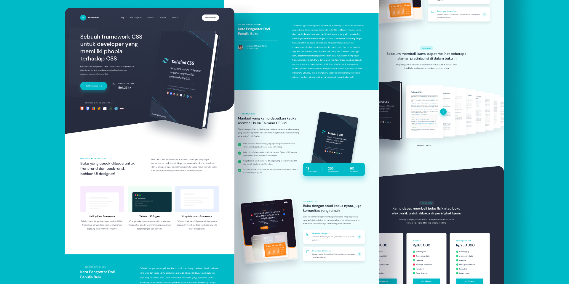
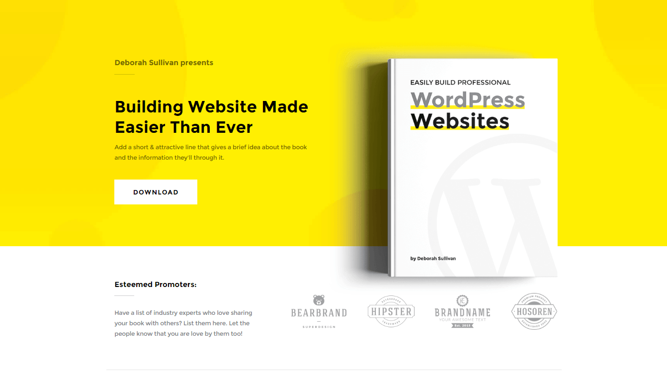
Ideal Structure of an Ebook Landing Page: What Should It Include?
- A compelling title directly tied to the reader’s goal (“12 Essential Actions to Accelerate Your Startup’s Growth”)
- A cover image and a quick content preview
- Key points summarizing tangible benefits
- A form visible above the fold (name, email—nothing more)
- A CTA button repeated at strategic intervals
- Testimonials or client logos to build trust
This structure guides both the visitor’s attention and action, minimizing exits from the conversion funnel.
At every stage, the ebook’s value becomes self-evident to the potential reader.
Creating an SEO-Optimized Headline for Your Ebook Landing Page
Your title must include the main keyword while emphasizing user benefit.
An effective example for an ebook landing page might be:
“2025 Guide: How to Double Your Sales with Digital Marketing”
A neutral or author-centered title misses the mark.
Positioning your headline around the reader’s problem and the solution offered by the ebook not only grabs attention but also strengthens your SEO performance.
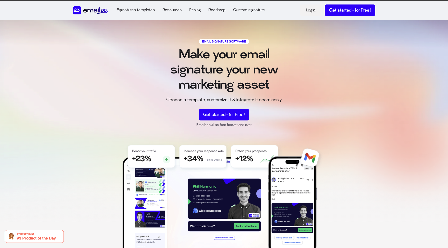
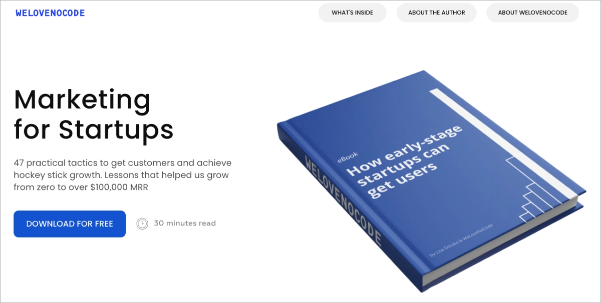
Using Ebook Cover Visuals and Previews to Build Trust
A realistic design that allows visitors to imagine reading the ebook on their own device inspires confidence.
Mockups displaying the ebook cover across multiple devices—tablet, smartphone, desktop—help visualize the experience.
Adding key excerpts or a few preview pages (screenshots or snippets) enhances credibility and transparency.
Users can instantly gauge the ebook’s substance and real value.
Highlighting Reader Benefits and Crafting a Clear Value Proposition
One of the most common mistakes is focusing solely on describing the ebook.
To convince, you must clearly express what the reader gains:
- Measurable progress or a new skill to acquire
- Simplification of a complex process
- Access to exclusive data, original studies, or real-world cases
Each benefit listed brings the visitor closer to the desired action—filling out the form.
Showcasing the Ebook’s Real Value to the User
Rather than simply detailing the table of contents, the page should answer one key question:
“How will this ebook make a real difference for me?”
For instance, you could mention how a professional improved productivity after applying a method explained in the guide.
Such testimonials offer tangible proof and humanize your promise.
These narrative elements strengthen the value proposition while making the content more memorable.
Optimizing the Capture Form to Reduce Friction
A short form dramatically increases download volume.
Usually, an email field—and sometimes a first name—is enough.
If the audience is strictly professional, one extra field (such as role or industry) can be justified, but always with a clear user benefit (“To personalize your guide”).
Best practices for form optimization:
- Remove unnecessary fields
- Ensure the CTA button is immediately visible and attractive
A good form shouldn’t act as a barrier—it should feel like a natural next step toward accessing the ebook.
Crafting an Effective Call-to-Action (CTA): Proven Examples That Convert
The success of your CTA button depends on two factors: visibility and activation.
Its color must stand out from the rest of the page, and its copy should clearly communicate the benefit:
Examples include:
“Get the Ebook”, “Download Now”, or “Claim My Free Guide.”
Adding micro-interactions—such as hover effects or subtle shadows—can increase click-through rates.
Some websites amplify this effect by repeating the CTA button after every major argument, multiplying conversion entry points.
Placing and Wording a Visible, Engaging CTA
To maximize conversion rates, make sure to:
- Place the CTA button in every high-value area (below the title, after social proof)
- Use strong action verbs that encourage immediate response
- Reinforce urgency or scarcity (“Limited Offer,” “First 30 Registrants Only”)
Optimizing the Content, Credibility, and Design of Your Ebook Landing Page
The success of an ebook landing page relies on three essential pillars: relevant content, credibility of the offer, and high-quality design.
Neglecting any of these aspects means sabotaging the true potential of your ebook.
Writing for Your Target Audience: Adapting the Page Structure to Lead Expectations
A truly user-focused content strategy assumes that your audience doesn’t share the same level of prior knowledge.
Ask yourself what challenges or questions your leads might have: what are their immediate goals?
A young entrepreneur won’t have the same expectations as an experienced decision-maker.
Best practices for audience-focused writing:
- Explain the main benefit in simple language
- Offer progressively detailed levels of information (from summary to expert insights)
- Reassure users about how quickly and easily they can access the ebook
Adapting your message builds credibility and speeds up conversion across diverse profiles.
Using Trust Factors to Boost Conversion
Reassurance elements rely on tangible proof: reader reviews, ratings, and download statistics.
Including even a short video testimonial humanizes the relationship between your brand and your audience.
Adding client logos or mentioning how many readers have already downloaded the ebook instantly creates social proof.
Effective reassurance elements include:
- Displaying genuine testimonials
- Highlighting satisfaction or download data
- Offering a money-back guarantee or commitment-free access (if the ebook is paid)
Integrating Testimonials, Reader Reviews, and Satisfaction Data
The power of social proof is undeniable.
Take the example of the startup LexiData: simply adding a short video review from a satisfied reader increased their ebook landing page conversion rate by 27%.
Author Presentation and Trust Signals: Building Credibility on Your Ebook Landing Page
The author’s identity adds credibility, especially in fields where expertise matters.
A professional photo, a short paragraph explaining authority on the subject, or references to media appearances—all these details help.
If data privacy is a concern, include a clear message about data protection (GDPR compliance, link to privacy policy).
Visitors must know who they are sharing their email address with, and feel the value of the ebook at first glance.
The Importance of Polished Design: Quality Visuals and Ebook Branding
A clean design, consistent color palette, visible logo, and high-resolution images lend credibility to both the page and the ebook itself.
Visuals aren’t decorative—they express the ebook’s tone and your brand’s personality.
Design best practices:
- Ensure graphic coherence between the ebook cover and the website’s visual identity
- Avoid impersonal stock photos
- Use icons to summarize key benefits
A well-designed page builds confidence and encourages downloads, even among hesitant visitors.
Creating and Promoting an SEO-Optimized Ebook Landing Page
Integrating SEO from the Start
Search engine optimization must be considered early in the process.
Include strategic keywords (e.g., “HR ebook”, “management guide 2025”) in your title tags, meta descriptions, and around the form or CTA button.
A clean hierarchy using H2/H3 headings helps Google index your page effectively.
SEO checklist:
- Optimize title length and keyword targeting
- Add internal links to other resources
- Ensure fast loading times for the best user experience
Ensuring Mobile Compatibility for Ebook Downloads
By 2025, nearly 75% of ebook downloads will come from mobile devices.
Responsive design is no longer optional—it’s a prerequisite.
Form fields must be easy to fill in, CTA buttons should be thumb-accessible, and visuals must adjust without losing quality.
Test the page’s usability across all devices (iOS, Android, and desktop) before publishing.
Mobile optimization essentials:
- Automatic image resizing based on screen size
- Readable fonts and well-spaced interactive elements
Ignoring mobile responsiveness can completely undermine all your other optimization efforts.
A/B Testing for Ebook Landing Pages: Optimize Titles, CTAs, Forms, and Visuals
Nothing replaces real-world testing.
A/B tests compare the performance of two versions of the same element—Title A vs Title B, a green vs blue CTA, a short vs ultra-short form.
Key metrics to analyze:
- Form completion rate for each variation
- Effectiveness of the CTA wording and promise
- Visuals that generate the most trust
Making decisions based on data ensures continuous improvement and rising conversion rates.
Integrating Your Ebook Landing Page into a Multichannel Promotion Strategy
Your ebook landing page is just one link in a broader ecosystem.
Always promote your ebook across multiple channels: LinkedIn posts, newsletters, Ads campaigns, and partner articles.
Tracking pixels installed on the page allow you to retarget unconverted visitors later.
Promotion best practices:
- Regularly share posts highlighting the ebook’s value
- Add the link to your email signature
- Run targeted campaigns via social media, Google Ads, or sponsored newsletters
This multichannel diffusion greatly increases your chances of reaching the right audience and generating qualified leads.
Avoid Common Mistakes That Hurt Ebook Landing Page Performance
No ebook landing page will succeed if it includes:
- A long, complicated form that discourages completion
- Weak, unclear, or poorly positioned CTA buttons
- A vague promise with no clear value
- A cluttered or non-mobile-friendly design
- Doubts about whether the ebook is free or credible (no social proof)
Each of these mistakes erodes user trust and damages your conversion funnel.
Avoiding them is the key to unlocking the full potential of your ebook.
FAQ – Ebook Landing Page
How do I choose the right visual for an ebook landing page?
The ideal visual should reflect your ebook’s tone and credibility while reassuring users of its quality.
Use a mockup that shows the cover displayed on a tablet or smartphone, and favor original imagery over generic stock photos.
A realistic design grabs attention and encourages downloads.
How many fields should an ebook landing page form include?
Two to three fields at most—usually first name and email—are recommended.
Adding job title or company makes sense only if it supports your marketing follow-up.
Too many fields slow down conversion and lower form completion rates.
What’s the difference between an ebook landing page and a homepage for downloads?
An ebook landing page has one single purpose: driving downloads through a distraction-free journey.
A homepage, on the other hand, offers multiple navigation paths that scatter attention.
That’s why the landing page always outperforms in conversion, since every element is designed to push one clear action.
When is the best time to display a CTA on my landing page?
Place a CTA button above the fold—visible from the first screen—and repeat it after every major argument (testimonial, key benefit, content excerpt).
The goal is to capture both impatient visitors and more cautious readers by offering multiple entry points throughout the page.