The strategic opposition between a landing page and a homepage lies at the heart of digital performance analysis—whether you’re measuring the commercial success of a website or evaluating a marketing campaign.
When the goal is to guide a visitor toward a specific action or establish brand credibility, distinguishing between these two core elements of web design becomes essential.
Many businesses still make the mistake of confusing these formats or trying to merge their functions, which often weakens the effectiveness of both.
Yet it’s proven that the power of a landing page, designed for fast conversion and immediate engagement, contrasts with the broader, more structured purpose of a homepage, which aims to present the brand as a whole and orient the user.
For instance, the fictitious startup NeoBike illustrates this difference clearly: by doubling its conversion rate on a dedicated product launch landing page (from 3% on the homepage to 9.6% on the targeted page), the company attributed much of its success to choosing the right entry point for its campaign.
Today, as digital marketing relies more and more on advanced tools like Google Ads and Facebook Ads, understanding how each type of page works is a top priority for any brand that wants to perform online.
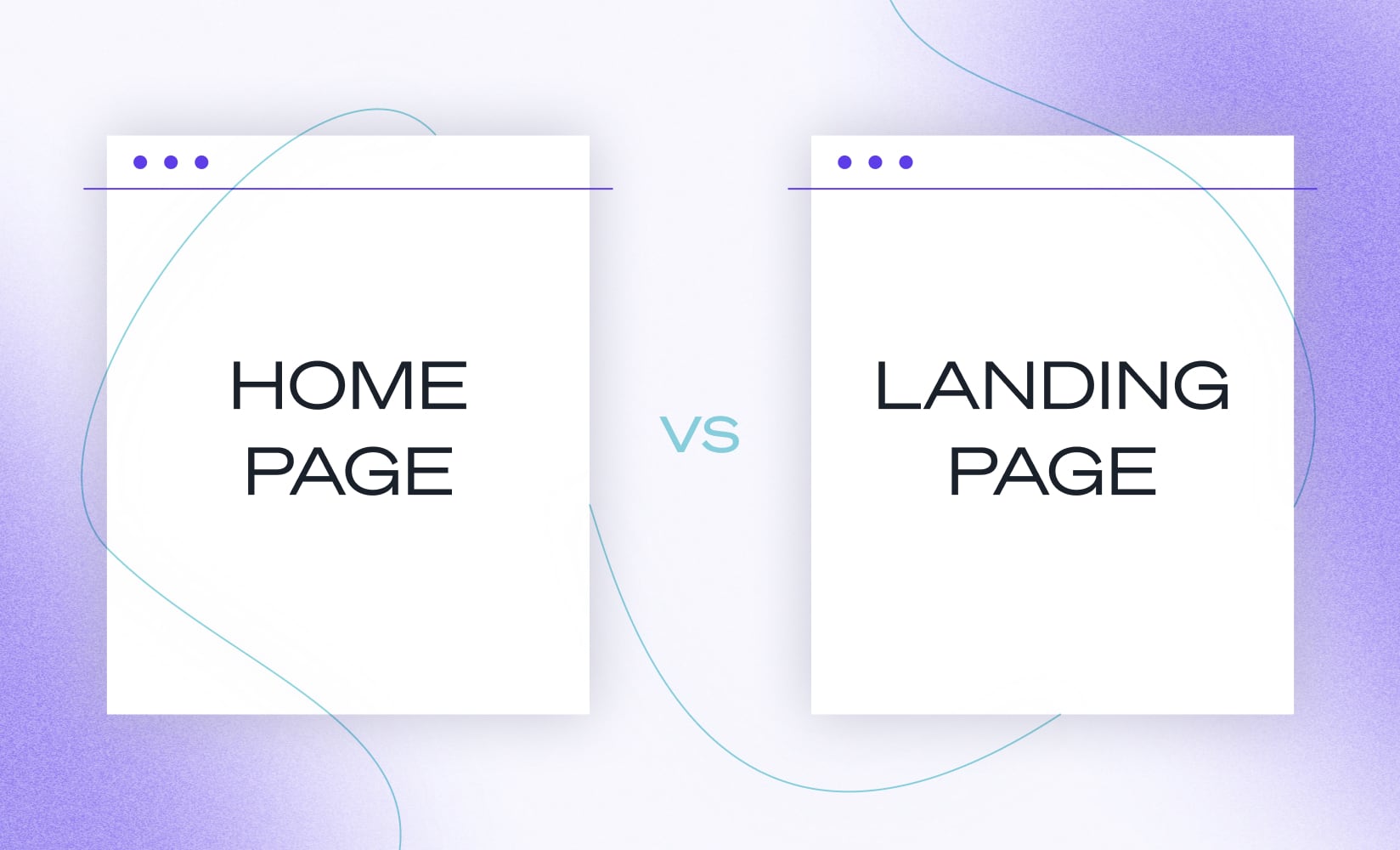
Landing Page vs Homepage: A Strategic Difference That Drives Conversion
Studying the landing page vs homepage distinction means separating two strategic pillars of digital marketing.
On one side, the homepage represents the main entry point of a website—a full showcase of the brand.
On the other, the landing page strips away all unnecessary elements, focusing entirely on driving engagement through immediate conversion.
This difference, far from trivial, shapes the entire customer journey.
A landing page doesn’t welcome just anyone—it targets a specific audience, coming from a Google Ads campaign, an email marketing link, or a social media ad. Its single goal: to turn qualified traffic into a lead or customer.
The homepage, on the other hand, offers multiple paths, builds brand identity, and establishes trust from the very first interaction.
To maximize conversion, a clearly organized engagement funnel is key. Numerous UX audits and field studies confirm the need for a strict separation between these two types of pages.
Homepage: Brand anchor point, broad overview of offers, multiple paths available
Landing page: Specialization, ultra-focused on one conversion, single message
Main Objective: Conversion vs Brand Discovery
The homepage primarily introduces the brand’s world, mission, and values.
It aims to reassure, emotionally engage, and guide users toward different offers. Visitors explore the brand’s full range of products or services, navigate freely, compare options, and start building trust.
By contrast, the landing page concentrates all its resources on driving immediate action—a signup, purchase, free trial, or contact form submission.
Every element is optimized to increase conversion rate and click-through on a single, clearly defined CTA (Call to Action).
A 2023 Unbounce survey confirmed that in France, optimized landing pages see their conversion rates increase by an average of 30% compared to traditional homepages.
This performance stems not from chance, but from methodical design that eliminates all distractions.
Brand discovery: The homepage lays the foundation for long-term engagement
Direct conversion: The landing page leads users toward a measurable action
Focus and User Experience: Targeted Simplicity vs Comprehensive Navigation
Every high-performing landing page removes unnecessary elements—no secondary menus, no blog feed, no external links.
The experience is intentionally minimalistic, built to persuade through a focused message centered on one conversion benefit.
The visitor is guided through a single, optimized path toward the CTA.
Conversely, the homepage presents a complete digital universe.
Users can navigate freely, explore, compare, and gather information.
While this abundance of content can create some friction, it also offers long-term engagement opportunities.
UX studies have shown that more than 68% of new visitors expect a full, cohesive experience right from the homepage.
Landing page: Removes nearly all traditional navigation for a clear, direct message
Homepage: Offers a rich menu structure that encourages exploration and self-guided discovery
Defining an Effective Landing Page: Features, Design, and Goals
A landing page holds a central role in today’s digital marketing toolkit.
Its strength lies as much in its minimal architecture as in its power to persuade quickly.
This format is designed to capture the attention of qualified traffic, generate leads, boost sales, or trigger an action through a single, unambiguous message.
Key characteristics of a high-converting landing page:
- One conversion goal per page
- Clean design and no secondary navigation to avoid drop-offs
- Clear focus on the benefit and value proposition
- Prominent, irresistible CTA
- Social proof (reviews, testimonials, client logos, satisfaction scores)
- Short, simple forms to encourage lead generation
Statistics back up these results: according to HubSpot, landing pages with a single action achieve an average 25% conversion rate, compared to less than 5% for standard homepages.
This explains why 86% of marketing managers plan to increase their landing page budgets by 2025.
Minimalist Design and Single Call-to-Action: The Core of Performance
The minimalist design of landing pages is one of the main pillars of conversion.
By removing distractions—no global menus, no unnecessary footers—it creates a seamless, predictable flow.
The visitor’s focus stays entirely on the CTA, whether it’s a demo request, a purchase button, or a webinar signup.
Essential design principles:
- Strong hero image or visual, without clutter
- Short, benefit-oriented copy
- High-contrast CTA button for immediate visibility
The NeoBike example illustrates this perfectly: a single “Try for free” button generated 37% more clicks than a homepage offering three different options.
This success underlines the efficiency of the landing page design, especially in a mobile-first world.
According to Think with Google, by 2024, 70% of landing page conversions came from mobile devices.
Types of Landing Pages: Lead Generation, Sales, Click-Through, and Squeeze Pages
There are several main types of landing pages, each tailored to a specific marketing objective:
- Lead Generation Page: Captures emails or user data in exchange for a resource (white paper, audit, free trial).
- Product Sales Page: Drives immediate purchases with a value-driven pitch reinforced by social proof.
- Click-Through Landing Page: Serves as an intermediate step before purchase, explaining benefits before redirecting to checkout.
- Squeeze Page: Ultra-short format to capture minimal user info—perfect for email marketing campaigns focused on quick conversions.
Each type of landing page adapts its content and structure depending on its goal: long or short forms, inclusion (or not) of testimonials, explanatory videos, or image-based arguments.
The entry context—whether from Google Ads, social networks, or email campaigns—also plays a decisive role in performance.
Homepage: Role, Structure, and Benefits for Brand Credibility
The homepage, often the first impression a visitor has of a brand, serves a broader structural purpose.
It welcomes every kind of audience—from informed prospects to first-time visitors—and fulfills two main goals: establishing credibility and directing users to relevant subpages.
Unlike the landing page, the homepage offers multiple entry points.
It highlights product or service ranges, showcases values, news, and events, and builds long-term trust through certifications and brand achievements.
It’s the central hub where branding, initial engagement, and navigation converge.
Main elements of a homepage:
- Full presentation of the company and its story
- Access to multiple sections (products, services, blog, support, contact)
- Multiple CTAs (sign up, contact, learn more, buy)
- Emphasis on social or environmental commitments
- Carousels, updates, buying guides, and FAQs
This variety of paths makes the homepage valuable as a comprehensive exploration space.
Dropdown menus, thematic filters, and product carousels help visitors shape their own journeys.
This abundance encourages engagement across multiple touchpoints: reading blog articles, subscribing to a newsletter, joining a community, or accessing support.
Homepage advantages:
- Multiple navigation routes based on visitor profile and intent
- Several CTAs driving engagement across different verticals
- Rich information hub with guides, FAQs, blogs, and testimonials
The risk? Too many choices can dilute immediate conversion rates, but this broad approach strengthens brand awareness and trust over the long term.
Landing Page vs Homepage: 5 Key Differences

To avoid any strategic confusion, it’s essential to compare these two architectures with precision.
Five main criteria help clearly distinguish the landing page vs homepage debate.
Comparison 1: Marketing Objectives — Singular vs Multiple Goals
A landing page focuses on one single action: sign-up, purchase, free trial, or booking a demo.
Every piece of content serves this one and only conversion goal.
In contrast, the homepage speaks to all types of users and offers multiple possible paths—reading information, requesting a quote, visiting the blog, exploring products, and more.
Landing page: One centralized goal
Homepage: Multiple complementary objectives
Comparison 2: Design — Landing Page Minimalism vs Homepage Richness
Simplicity drives the landing page. Navigation bars, secondary sections, and distractions are removed. Only reassurance elements and a clear CTA remain.
The homepage, on the other hand, relies on abundance—multiple visuals, carousels, videos, an extended navigation menu, and numerous entry points.
Landing page: Ultra-minimalist design, short content, visible on a single mobile screen
Homepage: Evolving design, deeper structure, and multiple touchpoints
Comparison 3: Traffic Source and Targeting
Landing page: Targeted ad campaigns, email marketing, product launches
A landing page attracts a specific audience, coming from a Google Ads or Facebook Ads campaign, or from a targeted email. It fits perfectly into a conversion-focused funnel.
For example, an e-commerce site launching a new electric bike creates a dedicated landing page, A/B tested within its Google Ads campaign targeting the keyword “urban electric bike,” achieving a 13% conversion rate.
This same targeted logic applies to lead generation, with ultra-short forms following a Facebook Ads or email campaign.
Homepage: Organic search, direct traffic, first visits, brand discovery
In contrast, the homepage receives organic traffic, direct visits, links from partners, or word of mouth.
It becomes the entry point for discovering the brand—a central hub for building trust and long-term relationships.
Landing page: Qualified audience, strong intent, optimized conversion rate
Homepage: Diverse traffic, varied expectations, higher engagement required
Comparison 4: Navigation — No Distraction vs Central Hub
Navigation on a landing page is intentionally absent or invisible.
The visitor follows a linear path, with no escape options—everything points toward the goal.
The homepage, by contrast, is full of menus, internal links, and navigation paths.
It becomes a central hub, sometimes even a digital labyrinth for indecisive users.
Landing page: No navigation, linear journey, reduced exit rate
Homepage: Full navigation, free exploration, lower conversion rate but stronger long-term engagement
Comparison 5: Conversion Rate and Performance
The numbers speak for themselves.
An optimized landing page typically achieves conversion rates between 9% and 20%, reaching up to 30% for top-performing lead generation campaigns (Unbounce, 2024).
The homepage, on the other hand, often caps at 2–3%, since visitors face too many choices, leading to conversion dilution.
This difference—now the true battleground of web performance—explains why landing pages dominate Google Adsand Facebook Ads campaigns that demand immediate results.
Landing page: Measurable performance, high conversion rate, rapid engagement
Homepage: Broader performance scope, diluted conversion, longer engagement time
Best Practices, Limitations, and Emerging Trends for Landing Pages and Homepages
Mastering the landing page vs homepage difference means learning to use both formats in synergy.
Digital professionals now recognize that their complementarity boosts results instead of creating overlap.
However, some pitfalls remain—and new trends are already redefining how both formats are built for 2025.
Avoid Confusing Landing Page and Homepage: How Complementarity Maximizes Results
The most common mistake is trying to turn a landing page into a mini-website or simplifying a homepage down to a few lines.
Yet each has its own purpose and field of action:
Landing page: Immediate conversion trigger—ideal for capturing only the hottest leads or ready-to-buy customers.
Homepage: The foundation of brand identity—essential for long-term engagement and overall credibility.
When used together, these two tools strengthen each other: the homepage initiates the discovery journey, while the landing page drives the visitor to act.
This synergy forms the backbone of both short-term performance and long-term engagement.
Limitations of Each Format: Narrow Focus vs Message Dilution
No landing page can satisfy every user intent. Its extreme focus limits access to broader information (such as general insights or multiple comparisons).
Without post-conversion nurturing, engagement often fades quickly.
Conversely, the homepage sometimes suffers from the “marketplace effect”: too many choices, a scattered journey, and weakened conversion.
Landing page: Maximum conversion efficiency but limited engagement outside its target
Homepage: Scalable engagement but weaker urgency to act
New Trends: Mobile-First Design, AI Personalization, Interactivity, and Real-Time Social Proof
Recent innovations are transforming the landscape of web design:
- Mobile-First Design: Landing pages are now built primarily for vertical scrolling, integrating short videos and tactile micro-interactions.
- AI Personalization: Dynamic content adapts to the visitor’s source—did they arrive from a Google Ads campaign? The copywriting changes in real time.
- Live Social Proof: Trustpilot score widgets, recent purchase notifications, and customer video reviews now appear on both landing pages and homepages.
The evolving context demands constant reflection: combining the precision of a high-converting landing page with the trust-building power of a homepage is the key to an effective digital strategy in 2025.
FAQ – Landing Page vs Homepage
What exactly is a landing page?
A landing page is a dedicated web page built for a single goal: prompting the visitor to take a specific action—filling out a form, making a purchase, requesting a demo, or downloading a resource.
It stands out for its minimalist design, lack of unnecessary navigation, and presence of a single clear CTA, enabling quick and optimal conversion.
How does the homepage differ from a landing page?
The homepage presents the entire company, offering multiple navigation paths and aiming to build trust.
It targets a wide audience and provides many engagement opportunities, while the landing page focuses on one action and addresses visitors coming from a specific marketing campaign.
Why not use a landing page instead of a homepage?
Replacing a homepage with a landing page would dilute the brand’s message, limit the amount of information available, and reduce credibility.
Both formats serve different needs, and their complementary use maximizes the overall effectiveness of a digital strategy.
What are the new design standards for landing pages?
Mobile-first layouts, real-time AI personalization, short-form video integration, and dynamic social proof are the major design trends for landing pages in 2025.
They aim for efficiency, accessibility, and immediate emotional impact.
How do you measure the performance of a landing page?
The performance of a landing page is primarily measured by its conversion rate, but also by metrics such as bounce rate, cost per lead or acquisition, and overall ROI of the campaign.
Continuous A/B testing remains the most effective way to optimize and improve these results over time.