Webinars have reshaped modern marketing dynamics, becoming a key lever for generating qualified leads. However, their effectiveness doesn’t rely solely on great content or the expertise of the speakers. The determining factor lies in the webinar landing page, designed as a true registration and engagement accelerator.
When it clearly answers essential visitor questions — relevance of the content, speaker credibility, reliability, and clarity of date and time — it can transform curious visitors into active registrants.
Why an Optimized Webinar Landing Page Is Essential for Generating Qualified Leads
In a results-driven marketing strategy, a webinar represents an opportunity to showcase expertise, value, and relevance.
But without an optimized landing page, those efforts rarely translate into actual sign-ups or qualified audiences.
A dedicated landing page clarifies the offer, reassures visitors, and accelerates the path to registration.
It establishes credibility around the speakers, structures the event agenda, and encourages users to click the CTA button.
In practice, an optimized webinar landing page should answer three key questions:
- Why is this webinar valuable for me? (problems solved, results delivered)
- Who is leading the webinar? (hosts, experts, speakers)
- When will the event take place? (date, time, and time zone)
Without this harmony, visitors leave without taking action — and the ROI of your webinar quickly declines.
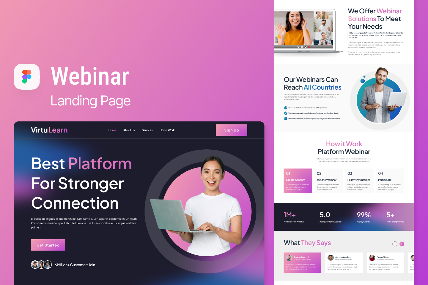
Turning Visitors Into Registrants: The Central Role of a Compelling Webinar Landing Page
Converting a visitor into a registrant depends on a clearly stated promise supported by solid proof elements.
The headline should combine a specific topic, tangible benefits, and genuine urgency or scarcity to prompt immediate action.
Then, a concise, impactful description should focus on outcomes and problems solved — not just a list of topics.
The CTA button, visible at the top, bottom, and ideally mid-page, acts as a powerful registration signal.
The form should remain short and intuitive, requesting only essential details (name, email, job title).
Another pillar is social proof — testimonials, client logos, and awards — that build trust and reduce hesitation.
Finally, clarity is everything: visitors should instantly understand what they’ll gain by registering and why this webinar matters to them — right from the first screen.
How a Webinar Landing Page Differs From a Standard Registration Page
A standard registration page may suffice to collect emails, but a dedicated webinar landing page goes further.
It tells a story, promotes an experience, and prepares participants for engagement.
It highlights speakers and their expertise, introduces guest participants, and can even offer flexible viewing options (on-demand access, multiple time slots).
The difference also lies in the level of detail: a proper landing page includes date and time management tools (time zone selectors) and conversion mechanics designed for instant registration, not just a redirection to another form.
The Ideal User Journey on a Webinar Landing Page
The ideal flow follows a natural sequence:
quick overview → purpose of the webinar → speaker introduction → benefits → social proof → registration form.
The first screen should contain the key elements: a clear headline, visible CTA, date and time, and a strong promise.
Then, a short description with a list of 3–5 benefits helps set expectations.
Next comes social proof and speaker details to strengthen credibility.
The registration form should be accessible without excessive scrolling and fully optimized for mobile.
Structuring a Webinar Landing Page to Maximize Conversion
Crafting a Strong Headline for Your Webinar Landing Page
- Keep it concise, benefit-focused, and include the date if possible.
- Avoid abstract wording and use real, measurable outcomes.
- Run A/B tests to evaluate headline impact on registrations and CTA clicks.
Balancing Urgency and Real Scarcity: Best Practices
Using time-based urgency (countdown timers, registration deadlines) can boost conversions — as long as it’s transparent and accurate.
Real scarcity (limited spots) can also increase attractiveness but must be genuine, not fabricated.
Abusing these psychological triggers can backfire — leading to loss of trust and lower long-term conversion rates.
The best strategy: combine both honestly — a firm date and limited availability, without exaggeration.
Writing a Concise, Impactful Webinar Description
Your description should read like a micro-narrative: context, customer pain point, proposed solution, and expected results.
Use bullet points to present 3 to 5 tangible benefits and key problems your webinar addresses.
Avoid long sentences — maintain a fluid reading rhythm where each point leads naturally to the next action.
Highlight 3 to 5 Key Benefits on the Webinar Landing Page
Benefits should be clear, scannable, and visually structured — ideally with icons or simple visuals.
Each benefit should act as a promise:
- “Save X hours per week with a proven method.”
- “Reduce your acquisition costs by Y%.”
- “Adopt a customer-centric approach to increase engagement.”
Showcasing Speaker Expertise on Your Webinar Landing Page
- Display speaker names, titles, and relevant experience clearly.
- Use professional photos and concise bios for credibility.
- Add links to past talks, publications, or interviews to reinforce authority.
Building Trust With Relevant Social Proof
Social proof remains a powerful conversion lever.
Include authentic testimonials, relevant feedback, and partner or client logos to instantly reinforce credibility.
Optimizing the Webinar Landing Page: UX and Key Elements

Managing Time Zones for Global Audiences
For international audiences, integrate time zone management via dropdowns or dynamic links.
This feature avoids confusion, ensures punctuality, and simplifies registration.
A smooth calendar experience increases comfort, reduces hesitation, and boosts overall registration rates.
Testing CTA Colors and Copy to Improve Conversion Rates
A/B testing different CTA colors and texts helps identify the most effective combinations.
Bright red might attract attention on a light background, while deep blue can convey trust.
Keep the copy short, clear, and aligned with the webinar message.
Examples: “Register Now,” “Save My Seat,” “Join the Live Session.”
Test one element at a time to accurately measure each change’s impact.
Reducing Friction by Limiting Form Fields
The shorter the form, the higher the conversion rate.
Ideally, use 3–4 fields max (first name, email, job title, company if needed).
You can offer personalization options after registration, not before.
Ensuring an Optimal Mobile and Tablet Experience
Most visits now come from mobile.
Your mobile-friendly landing page should load fast, use legible typography, have well-spaced sections, and a one-click form.
Keep the CTA button visible at all times and minimize scrolling requirements.
Advanced Techniques to Maximize Webinar Landing Page Performance
Add Presentation or Demo Videos
Videos provide a quick preview of what attendees can expect and reinforce speaker credibility.
Short videos (30–60 seconds for intros, 2–3 minutes for demos) increase empathy and trust.
The goal: encourage sign-ups — not just curiosity.
Plan Post-Registration Follow-Up and Calendar Integration
Follow-up is key to ensuring attendance.
Send instant confirmations, automated reminders, and offer one-click calendar integration.
This not only improves participation rates but also strengthens long-term engagement.
FAQ – Webinar Landing Page
How many fields should a webinar registration form include?
Limit your form to 3–4 essential fields (first name, email, job title, company).
Shorter forms reduce friction, improve conversion, and encourage quick sign-ups.
How can I increase participation after registrations?
Send a confirmation email immediately after registration, followed by automated reminders (1 day and 1 hour before).
Include teasers or short personalized videos to maintain excitement until the event.
What elements are essential for an effective webinar landing page?
- A clear, compelling title with the topic and date
- Visible CTAs placed strategically
- Speaker presentation (photo, bio, credentials)
- 3–5 clear benefits
- Authentic social proof (logos, testimonials)
- A fully responsive design
Should I include videos on a webinar landing page?
Yes — a short intro video (30–60 seconds) can significantly boost conversions by creating a personal connection and demonstrating value.
Key Takeaway
A high-performing webinar landing page is far more than a registration form — it’s a conversion engine, turning interest into action through clear structure, persuasive messaging, and smooth user experience.
Every element matters: the headline, social proof, content hierarchy, and CTA must work together to maximize sign-upsand build webinar credibility.
At ConvertLab, we design custom landing pages that blend powerful design, marketing psychology, and CRO optimization.
Contact us today to turn your webinars into true conversion drivers.